Introduction
EBB & Flow Coffee is an artisan coffee roaster based in Malaysia, working with small-batch speciality coffee for enthusiasts and casual drinkers alike. The brand needed an identity that felt both premium and warm, speaking to people who value craft and quality in their coffee.
Walk Production was appointed to develop the consumer branding, covering logo design, a full label and packaging system, and supporting graphic design for the coffee collection. The work ran across visual touchpoints from retail packaging to promotional materials.
Our Solutions
Logo design
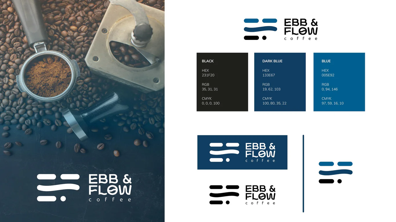
The emblem design is a combination mark built from the brand initials ‘E’ and ‘F’ with a wave element that picks up the ‘Flow’ in the name. The rectangle-based logomark adapts to packaging of different sizes. Blue, navy and black make up an elegant palette that reads as refined and dependable.
The wordmark incorporates the wave element from the logomark, with upper case lettering providing a bold impression. Responsive logo versions include horizontal primary format, vertical secondary format, and standalone logomark for small applications such as bottle caps and social media profile images.
Label and packaging system
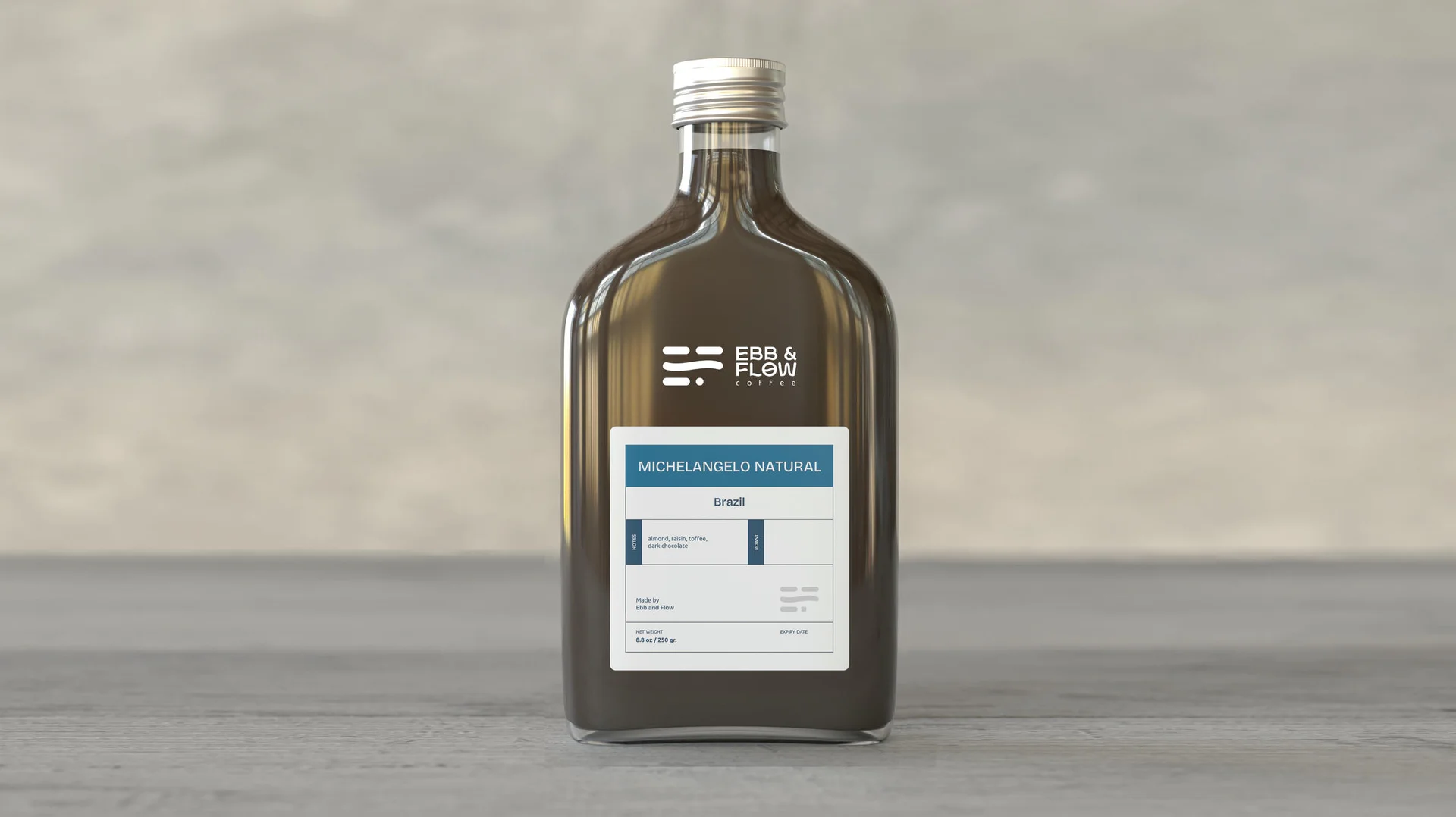
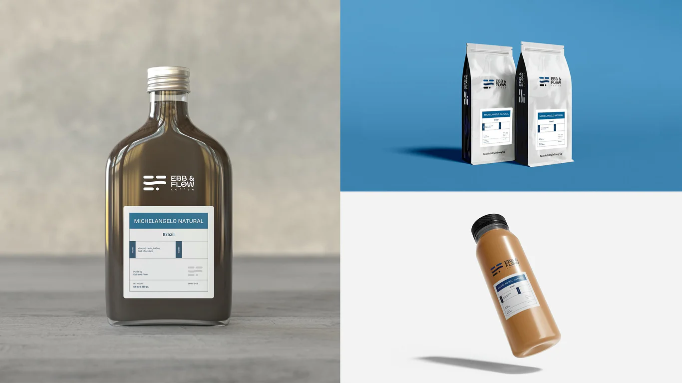
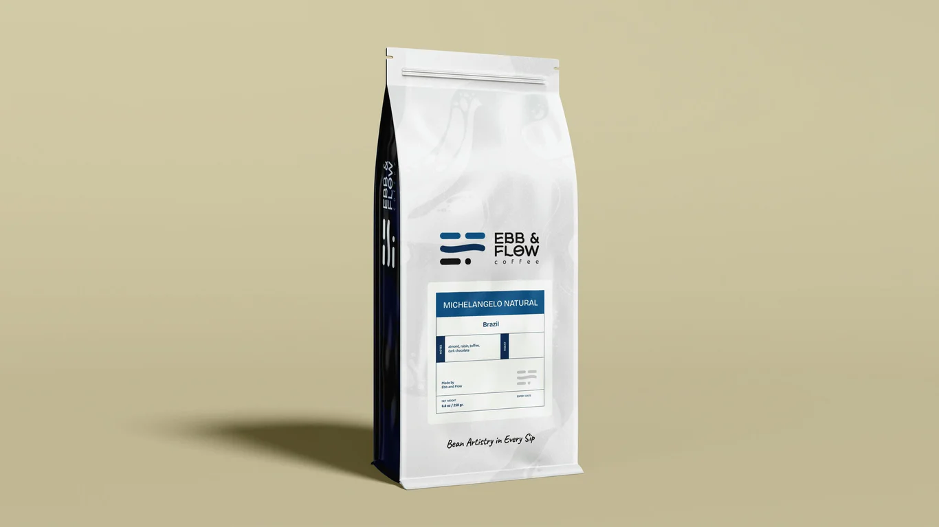
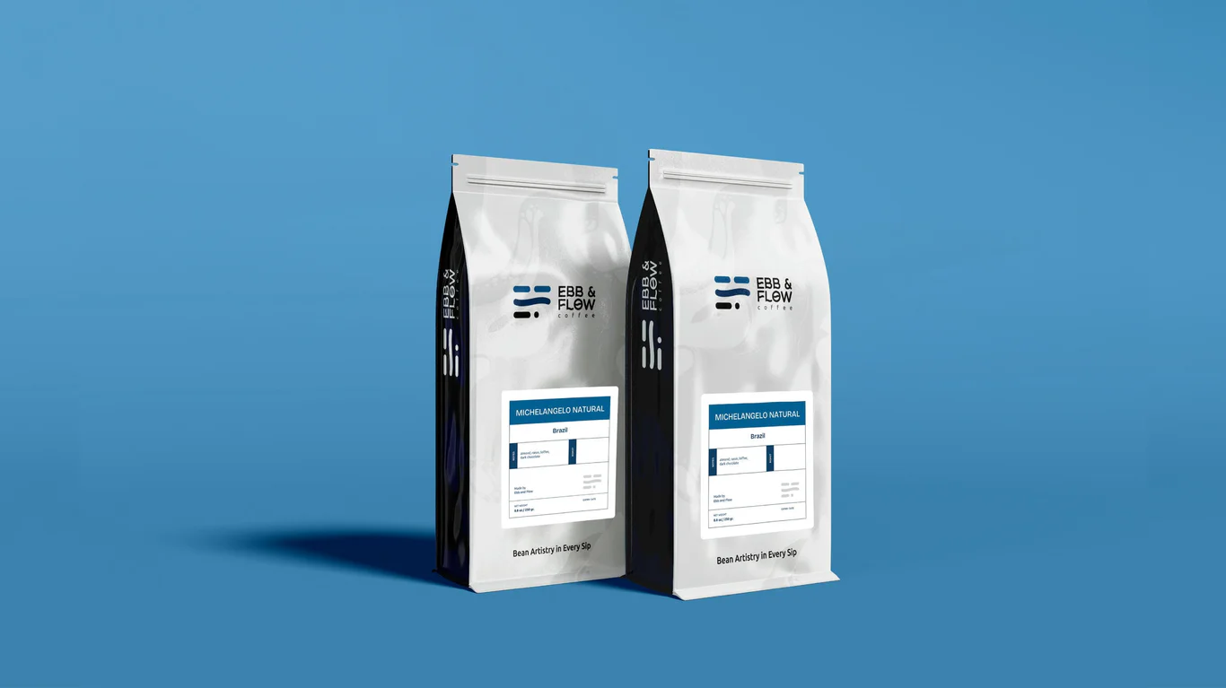
The product packaging and graphic execution spans the entire coffee collection. Coffee bean bags feature the brand identity with the tagline ‘Bean Artistry in Every Sip’, available in different sizes for retail and wholesale. Bottle stickers include product information, roast notes, and space for handwritten brew and expiry dates adding an artisan touch.
The sticker anatomy accommodates roast details, origin, flavour notes, and roaster information. Each packaging piece maintains visual consistency whilst allowing individual coffee varieties to communicate their unique characteristics through colour coding and variety-specific details.
Graphic design and visual system
The creative brand development introduced marble patterns as the secondary graphic, picking up the fluid theme behind the brand name. The muted tones sit alongside the core identity and hold up across both light and dark backgrounds.
The graphic system runs across touchpoints, from packaging to promotional materials, for a consistent look. Grey complements the blue palette and adds a more refined feel to the brand. The system carries through seasonal promotions, event materials and digital content while keeping the brand recognisable throughout.
The Results
The branding programme gave EBB & Flow a distinctive identity that signals artisan quality. The packaging system holds together across the range, giving the products clear shelf presence and recognition.
The identity pairs premium appeal with warmth, positioning EBB & Flow as a credible choice for coffee enthusiasts. The graphic system leaves room for future product lines while keeping the brand character intact.
Project Gallery
Related Questions
Why is packaging design important for coffee brands?
Packaging communicates quality and brand positioning before customers taste the product. For speciality coffee, packaging must convey artisan craftsmanship and premium positioning whilst providing practical product information that helps buyers choose the right variety.
What makes an effective coffee brand logo?
Effective coffee brand logos balance sophistication with approachability. They should work at various sizes across packaging, digital platforms, and merchandise. The design needs to function on small applications like bottle caps whilst remaining recognisable at distance.
How do secondary graphics enhance packaging?
Secondary graphics add visual interest and brand recognition without overusing the primary logo. Patterns and textures create distinctive shelf presence whilst reinforcing brand personality. They provide design flexibility across different packaging formats and promotional materials.
What role do colour palettes play in coffee branding?
Colour palettes communicate brand strategy and design cues to consumers. Darker tones like navy and black suggest premium quality and sophistication. Muted earth tones convey artisan craftsmanship. The palette must work across packaging materials and printing methods.
Why include handwritten elements in packaging?
Handwritten elements add an artisan, personal touch that differentiates craft products from mass-produced alternatives. Spaces for handwritten dates communicate freshness and small-batch attention. This detail reinforces the brand’s commitment to quality and authenticity.