Introduction
TGA is a Malaysian automotive detailing company that works mainly with car dealerships, keeping showroom and fleet vehicles in presentable condition. As its dealership and corporate client base grew, the brief was to upgrade the brand identity to match the standard those clients expect, whilst keeping the focus on its core detailing services.
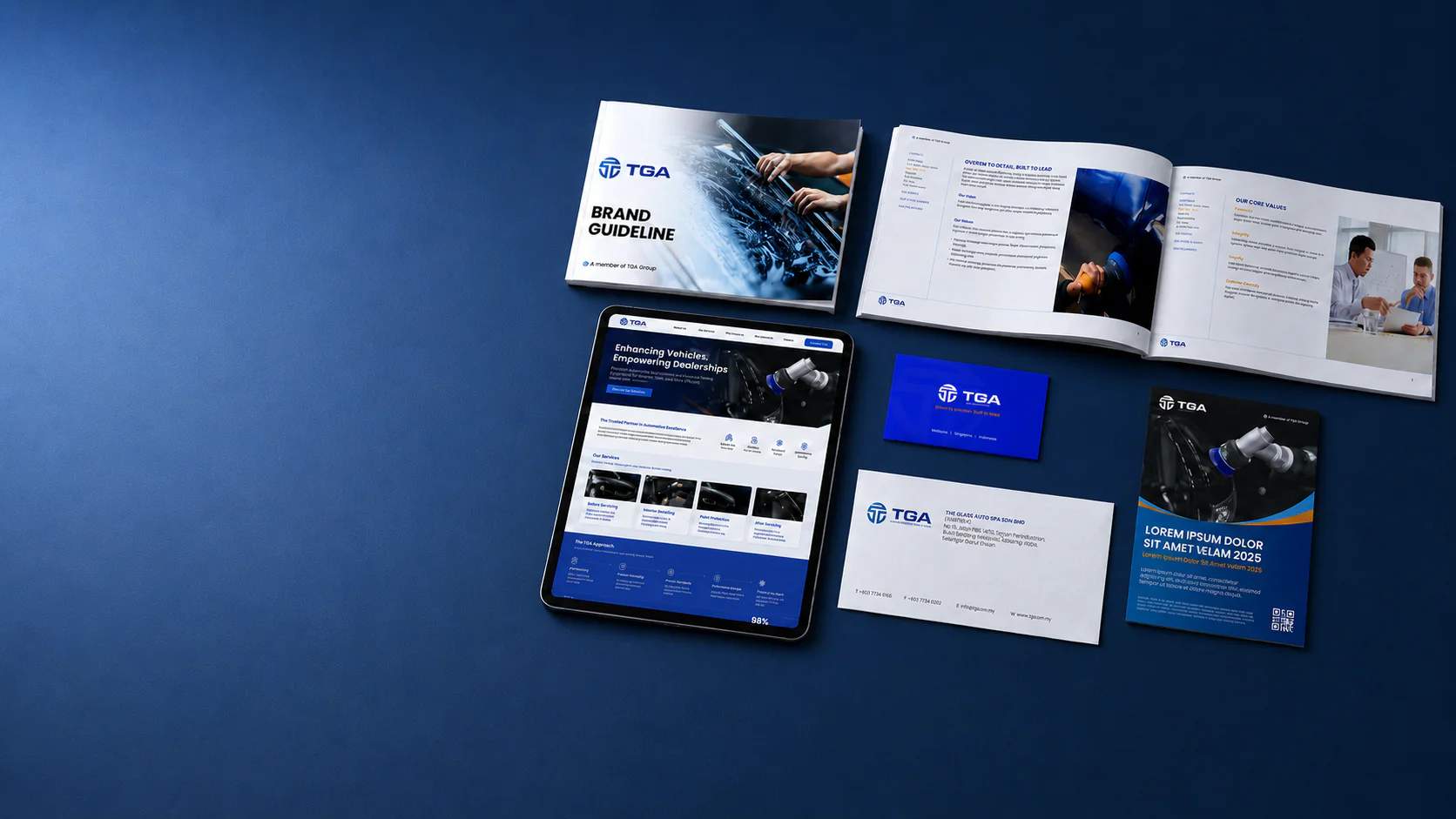
Walk Production was appointed to run a rebrand covering the logo, corporate identity, brand manual, company profile, PowerPoint master slides, product packaging and corporate website. The brand line “Enhancing Vehicles, Empowering Dealerships” sits at the centre of the identity: it states both what TGA does to the car and who it does it for.
Our Solutions
Logo, identity system, packaging
The new TGA logomark replaced the legacy wordmark with a higher-contrast lettering treatment. The palette pairs a blue gradient with a gold accent. Montserrat is the primary typeface across corporate touchpoints, with hierarchy rules for headings, sub-headings and body text in print and on screen.
Packaging for TGA’s care products was redrawn to match. The system keeps the same logomark and typography across the range and varies the palette by product category, so labels stay consistent as the range grows.
Brand manual, profile, website
The brand manual was written for a client whose team would mostly self-execute future collateral. Logo lockup rules cover the application range from print to digital. Colour and typography are specified with usage scenarios rather than as a flat palette swatch.
The corporate profile and PowerPoint master deck were built as the team’s pitch toolkit for new dealership and fleet accounts. The deck covers company background, service capabilities and case examples. The corporate website mirrors the same narrative, so a dealership researching TGA reaches a consistent picture across the deck and the site.
The Results
After delivery, the TGA team had a complete kit of marketing materials to carry into client meetings: the brand manual, company profile, master deck, packaging system and corporate website. The new identity rolled out across every customer-facing surface in a single launch.
With the rebrand in place, TGA pitches dealership and fleet accounts from one consistent identity instead of the mixed materials it carried before.
Related Questions
What is “Enhancing Vehicles, Empowering Dealerships” trying to say?
It names both sides of the business in one line: the detailing work done on the car, and the dealerships TGA does that work for. The line had to read on a workshop sign and on a dealership proposal cover without sounding like two different companies.
Why blue and gold for the palette?
Blue holds up on a corporate document. Gold reads as the finished, polished surface the work produces. Together they let the brand speak to dealership buyers and to drivers without needing two separate palettes.
Why was packaging part of the rebrand rather than a phase two?
TGA’s care products were already in customers’ hands under the older identity. Packaging is a customer-facing surface, so leaving it on the legacy brand would have undercut the rest of the rollout. The brief put packaging in the launch so every surface switched over at once.